Understanding Data through Visualisation
New Project of St. Pölten UAS Develops Analysis Tools for Biomedicine and Journalism

The volume and complexity of available data are increasing rapidly. For fields such as biomedicine and journalism, this means new possibilities for technological progress and economic success. However, methods to analyse these data cannot always keep up with the sheer growth of data. Visual Analytics (VA) is an upcoming research field that addresses this challenge.
The goal of the project SEVA – Self-Explanatory Visual Analytics for Data-Driven Insight Discovery of the St. Pölten UAS’ Institute of Creative\Media/Technologies is to assist users in getting to know new tools for visual data analysis faster. More specifically, the focus is on the application areas of data journalism and biomedical research.
Learning to Understand Data
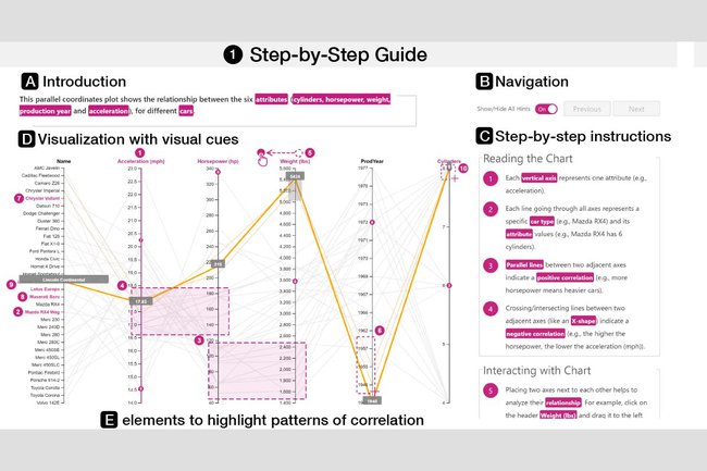
By means of this project, the researchers are trying to develop methods to find their way around visual analysis systems more quickly. These so-called “onboarding methods” should generated semi-automatically. The focus is on the users whose experience and understanding of visual data analysis tools for large and complex datasets are to be improved.
“The purpose of onboarding methods is to help users understand data visualisations and automated analysis algorithms, thereby exploiting the possibilities of available instruments”, explains Wolfgang Aigner, head of the project and of the Institute of Creative\Media/Technologies at the St. Pölten UAS.
“We notice with our customers that the data as well as the research questions are extremely complex and that simple visualisations fail to provide insights. In order to operate and understand more complex visualisations, however, our users need integrated and light-weight ‘onboarding methods’. The knowledge gained from the SEVA project helps us make progress in this respect”, says Dominic Girardi from datavisyn.
Focus on the Users’ Perspective
The research team conducted interviews with journalists, molecular biologists, and chemists in order to achieve detailed user analyses. This analysis of the collected data is currently in progress.
“Our interviews with data journalists and trainers of data journalism in the German-speaking area and the results of our online survey clearly show how diverse and multifaceted this field including the data histories, visualisations, and analyses are”, explains Eva Goldgruber from FH JOANNEUM.

“The ‘Drahtwarenhandlung’ develops data-based content for various media companies on a regular basis. One of the requirements for this – apart from close collaboration with the respective journalists – is that the involved persons have solid competencies in the field of visual data analysis. Thanks to the tools and knowledge from the SEVA project, the initial hurdle will be much lower in the future”, emphasises Stefan Emrich from Landsiedl Popper OG.
Experiments and First Results
Another focus of the researchers was on visualisation experiments to illuminate approaches to visualisation onboarding from the users’ perspective. Both TU Wien and FH JOANNEUM carried out studies in this respect. The data derived from these experiments are currently being evaluated. In qualitative experiments, traditional tutorials were compared to “scrollytelling” – a technique that has users scroll through a linear action on a one-pager – with the purpose of integrating them into the visualisation. The results showed that the participants preferred scrollytelling.
The Project SEVA
With the project SEVA, researchers of the St. Pölten University of Applied Sciences – together with TU Wien, FH JOANNEUM, Landsiedl Popper OG, and datasyn – strive to support journalists and biomedical experts in analysing data.
